Examples

Three finished websites. Open them.

Not pictures of websites — actual working pages, built by the same system that will build yours. Different trades, different colours, different words. Click through and scroll them on your phone.

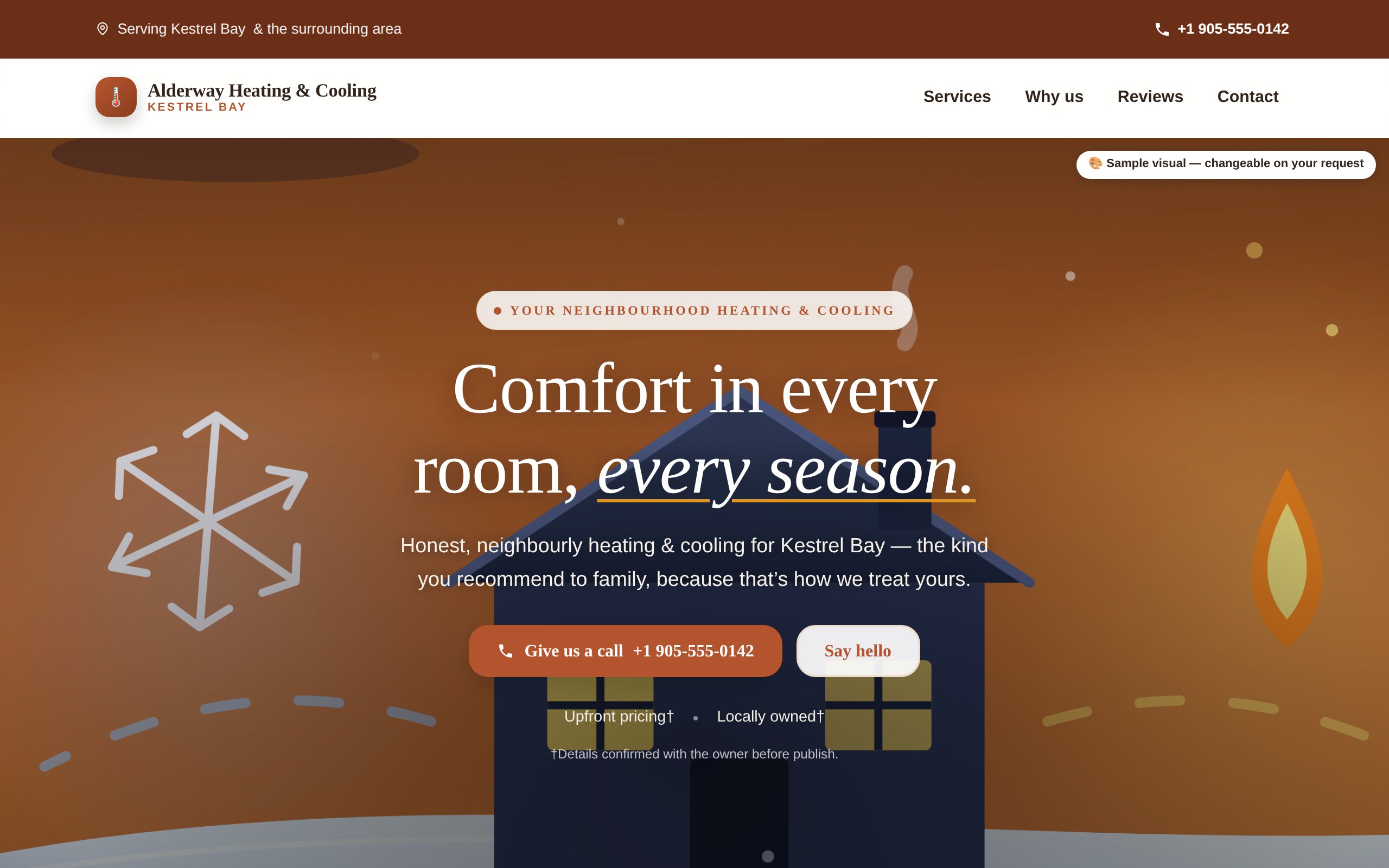
alderway-heating.example
Website for a heating and cooling company — warm orange, large headline, phone number and a call button.
Heating & cooling

Warm, and impossible to ignore

Alderway Heating & Cooling — a sample business

A trade where people are calling because something has broken. So the phone number is in the top bar, at the top of the page, and again on every scroll — and the whole page is built around one action.

  • ✓ Tap-to-call on every screen
  • ✓ Services laid out for someone in a hurry
  • ✓ Service-area and hours where people look for them
Open this website ↗
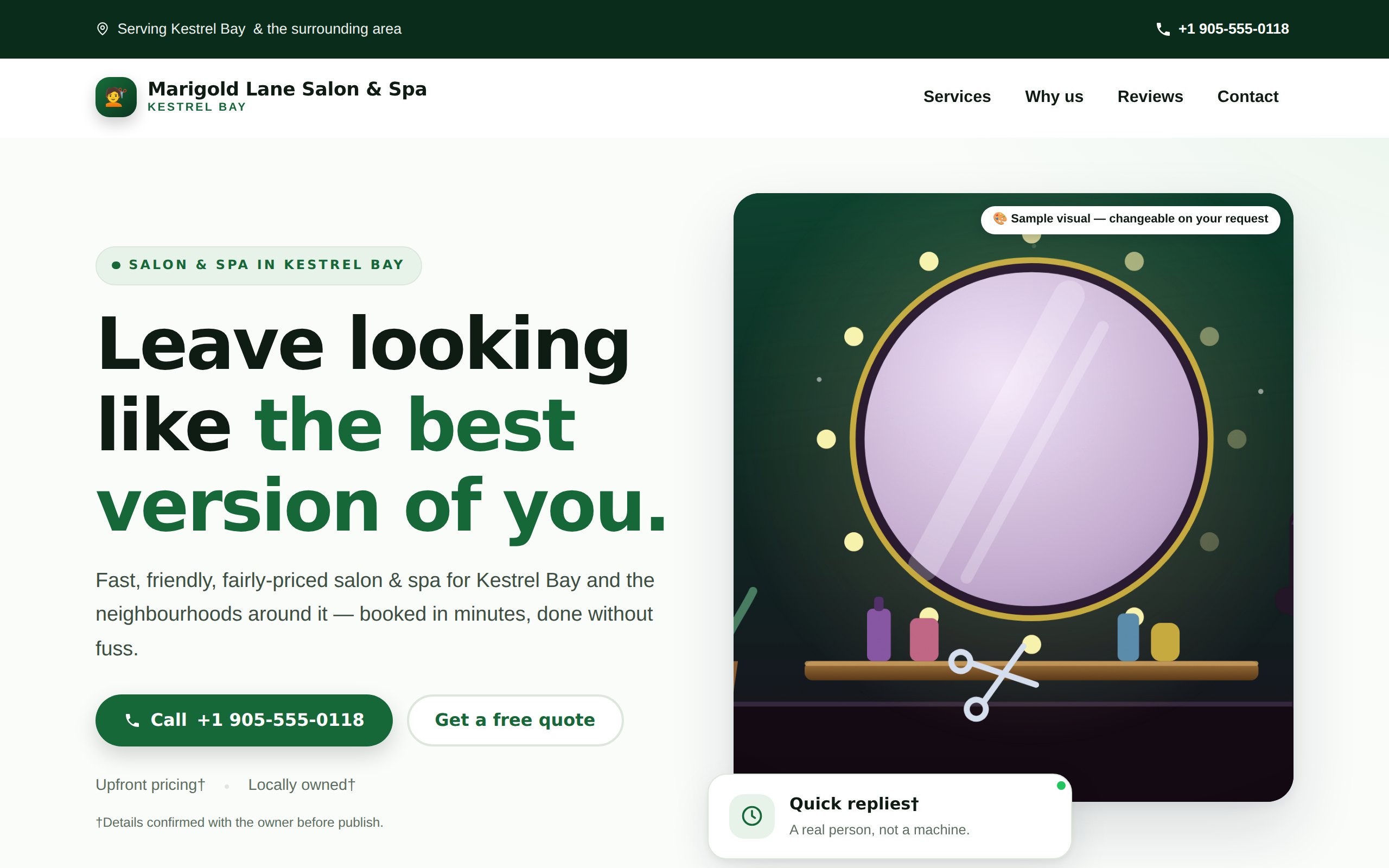
marigoldlane.example
Website for a salon and spa — deep green, with a booking button and a quote request.
Salon & spa

Calm, and quietly expensive-looking

Marigold Lane Salon & Spa — a sample business

Nobody books a treatment in a panic. This one is built to be browsed: generous space, soft colour, and a booking button that follows you down the page without shouting.

  • ✓ Booking or quote request front and centre
  • ✓ Room for your own photographs
  • ✓ Prices and treatments in plain language
Open this website ↗
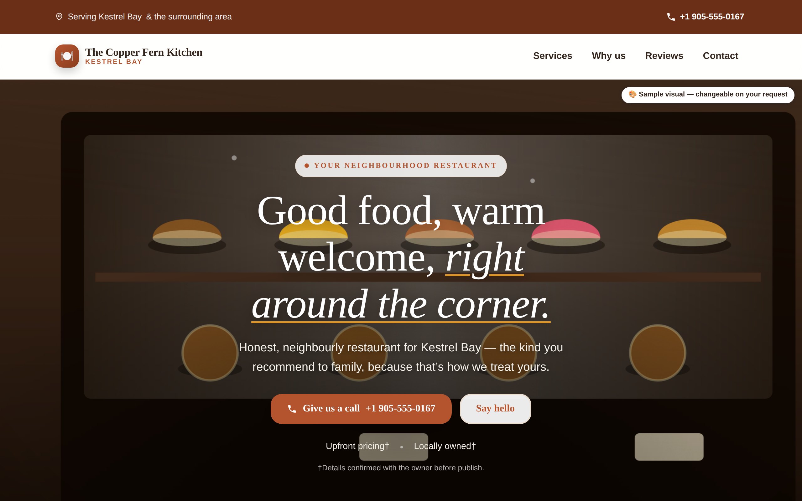
copperfern.example
Website for a restaurant — dark and cinematic, with a call button and a booking link.
Restaurant

Dark, cinematic, and hungry-making

The Copper Fern Kitchen — a sample business

A restaurant is sold on atmosphere before anybody reads a word. This one opens like a film: deep colour, a slow reveal as you scroll, and the two things people actually came for — the menu and the phone number — never more than a tap away.

  • ✓ Scroll-driven opening scene
  • ✓ Menu, hours and directions without hunting
  • ✓ Built to look right on a phone in a car park
Open this website ↗
These businesses are invented — deliberately

Alderway, Marigold Lane and The Copper Fern do not exist. The town does not exist, and the telephone numbers are in the range reserved for fiction. You will also notice there are no star ratings or review counts anywhere on them: this platform does not invent reviews, and that rule applies to our own advertising before it applies to anything else.

We will not show you a stranger's website either. Every concept we build for a real business is private to that business until they claim it, and it never appears on a page like this one.

Why they look different

Your trade decides the design. Not a template picker.

The three above came out of the same system. Nothing was chosen from a menu — the trade, the town and what the business does drove the colour, the layout, the wording and where the buttons went.

Colour that fits the work

An emergency trade gets urgency and contrast. A salon gets calm. A restaurant gets depth and appetite. The same palette on all three would make all three worse.

Words for your customers

Every line is written for the person who would actually be reading it — what they are worried about, what they need to know before they pick up the phone.

You can change any of it

Do not like the colour, the headline, the order of the sections? Say so and we change it. That happens before you pay anything, and as often as you like afterwards.

Want to see one with your name on it?

Tell us about your business and we will build it. Nothing to pay, nothing to cancel — you look at the finished website and decide then.